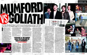
This feature article is about two bands (Mumford and sons & goliath). The article is set out across two pages which contain multiple pictures and a lengthy article.
The names of the two bands are set out in the top left hand corner of the article in a bold large black font. To accompany this there is a versus sign in red which is made to look very small as it has been created as though you are looking at it through a magnifying glass. This is something that I particularly like about the page as this has some invention rather than having something dull and plain. As always there is a sentence under the bold writing of the page which is featured in the article, this is slightly larger than that of the article to make it stand out from the page. The actual article for this double page spread features 6 half page columns across both of the pages which is what tends to be the style for NME magazine when they do feature articles. As this article is about two bands and the comparison it is an interesting read for the music fans.
This article has 8 pictures set out across it in the ratio of4:4 which are showing a fair review on both bands. This is something that I may have to take into account when I am creating my feature article as I would not want my magazine article to seem biased to any one band. The live pictures of each band are set out in different corners of each page which have little captions with them to tell the reader what the image is about. These pictures also show the type of crowd they attract and the target audience of their music. On the right hand side of the page there is a collage of 6 different photos from either band. Having all the photos grouped together makes the page look tidy and professional whereas if they were to be spread across the page then this may not make the page look as professional. This is a typical NME style as they have picture representations of the band followed by the captions to go with each.
No comments:
Post a Comment